Posts

Shuttlerock | New Zealand Software for User Generated Content

Shuttlerock | New Zealand Software for User Generated Content

PLEASE NOTE: Some of the details in this article have been rectified per recent conversations with Shuttlerock. These new details are noted below! Thanks for your feedback, Shuttlerock!

We’ve come across marketing software created by a business here in New Zealand called Shuttlerock. It sounds sort of science fiction-y and futuristic – something you might see in a Rae Bradbury novel. In a way, it could be next gen technology in content sharing and revolutionize how businesses aggregate and manage user content to their benefit.

Shuttlerock New Zealand Software for User Generated Content Creative Agency Secrets Aucklance

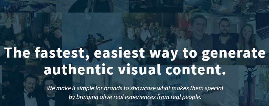
What Shuttlerock does with user generated content…

If you’re a business and have social media channels, have you ever wanted to capture all your customer feedback and testimonials in one place? Sure, leaving it in the platform from which it originated is perfectly acceptable. But, what about putting it in the one place in which your put the majority of your efforts, i.e. your website. Right now, this information has to be collected manually and configured in an appealing way so that your traffic, your customers and followers, can see: Hey! Other people like this product and have gone so far as to say something about it on the internet!

Shuttlerock New Zealand Software for User Generated Content Steps Creative Agency Secrets Auckland MarketingIncluding content aggregation, Shuttlerock takes it a few steps further

Besides collecting user content for your team to sift through, sort, and put on display on your website, Shuttlerock also helps you promote your brand to get more user generated content. How? Contests and promotions, of course! We know that one of the best ways to get engagement online is to incentivize your followers to promote you and your brand. You can get them to share their visual content promoting your brand and reward them for doing it. If done right, you’ll get a flood of content that you can then share, directly on your site. Not only do you get to share their excitement with your other followers but they’ll also be excited to see that their content is being shared with the world. What better way to encourage and reward loyal followers!

Who is using it and how.

Shuttlerock operates in its home country of New Zealand and now Japan and the US. In recent Shuttlerock news, Lady Gaga used the program to allow her followers in Japan to upload their content to her website. These photos, directly from the source (her fandom), will be collected and used to create a poster for her Japanese ‘Cheek to Cheek’ album. Now, that’s innovative.

What I find interesting about it.

This program puts power into the hands of your marketing team in a way that can really make a difference for the brand. For one, your team can manage the content via apps, as well as share their own related content, which gives the brand a more approachable, human aspect that’s approachable. And, for two, they will have social proof of what is and is not working for the brand that can be shared with upper management. I find that extremely valuable for businesses to really make a dent in their market and bring exactly what their customers want based on their feedback.

Shuttlerock New Zealand Software for User Generated Content Dollar Sign Creative Agency Secrets Auckland Marketing

The cost.

So, the only thing that I’m hung up on is this bit: the flat fee of $500 per month. For big businesses with marketing budgets that would make you swoon, $500 a month is a drop in the ocean. However we can’t forget about smaller businesses with much tighter marketing budgets – to whom $500 a month is completely unattainable. Shuttlerock, there’s nothing inherently wrong with your fees. I’m just suggesting you have a tiered option for businesses big and small. It could be based on company size, or social media following, even the amount of content that gets shared. Just saying.

UPDATE: From our recent contact with Shuttlerock we’ve been informed that the fees are $5,000 per month and are focusing on enterprises… BUT! they’re currently powering their way through some key partnerships with the goal to, eventually, have options for small and medium enterprises. Until then, we’ll look on Shuttlerock with starry eyes!!

But, way to go!

In a world where brands are continuously vying for attention from consumers, having visual, word-of-mouth content directly from other individuals on your website is amazing. And, as a consumer, seeing that other people just like you or from all the way across the globe also like this particular product, it just makes it more endearing! You want it, seeing and knowing that other people want it and are willing to share their opinions about it, all over the web.

CCH Learning, Webinar,Rebecca Caroe,

Get Your Business Website Working for you – Webinar Date

Business websites cannot be static “set-and-forget” marketing assets. Learn how to work your website so that it pays back the investment to the business. A well-run website should:

CCH Learning, Webinar,Rebecca Caroe,

CCH Learning Webinar

  •  Show up in natural search
  •  Answer visitors’ questions
  •  Bring enquiries, leads or sales to the business
  •  Persuade visitors to reveal their identity
  •  Showcase the expertise of the firm

This is a practical training webinar which will show you how to assess your website’s effectiveness and give you a checklist of what you can do to improve.

Included is a free eBook detailing 5 ways to improve how your website shows up in Google, what search terms your site shows up for, how to use title tags and meta descriptions.

Suitable for small and large firms.

Sign up for March 24th at 2.30 pm to 4.00pm 

Grow your mailing list fast – with a Lightbox

One of the simplest and yet, most effective methods we have found to grow our mailing list at Creative Agency Secrets, has been with the integration of a ‘Lightbox’ or a ‘pop-up’ plugin.

For any business operating with an online presence (let’s face it, if you’re not, you should be!), one of your primary objectives should be to acquire email addresses of potential customers to sell your glorious products and services.

However, relying on customers to navigate your site and opt themselves in is like telling your dog to fetch a ball that it doesn’t know exists. You need to show them the ball and especially why they want to chase it!

Okay, what is a lightbox?

To put it simply, a lightbox is an extension programme on your website that jumps up at your visitors displaying a customised message, usually requesting visitors to supply their email address in exchange for some kind of benefit. These benefits are typically newsletter subscriptions, prize giveaways, eBooks, online courses and other free rewards.

Key factors to building an effective lightbox

  • Firstly, your lightbox needs to stand out. Web users are exposed to multiple lightboxes on a daily basis. You need to ensure yours captures their attention. Most lightbox software allows customisation of colour schemes and text which aid in making it visually appealing when it appears on your website. Aside from being eye catching, you need a powerful and enticing message that will draw them in as well as outline clearly what they get.
  • The lightbox should serve a single purpose – sign up here to receive benefit ___. If you make it too complicated, visitors will lose patience and simply close it without completing the signup.
  • Offer your visitors something that they want. No visitor is going to sign up for your offer if they have no interest in it or cannot see any real value from it.
  • Set frequency and page display settings to something reasonable that will not drive people away. Your lightbox should be a passive reminder, not an aggressive punch in the face to get visitors to sign up.
  • Associate it with your email client management software and it will directly import the email addresses it collects into that programme, saving you time and effort.

Once you have your lightbox setup, you simply launch it and leave it to acquire all those precious email addresses on its own. Easy!

bizsparkup lightbox creative agency secrets

An example of a Sumo Lightbox on a client’s website

Some lightboxes work better than others however. Our previous (paid) lightbox on one client’s website appeared cluttered and ‘busy’ on the webpage. After some deliberation we decided we should see what else was available.

We assessed a number of alternatives across a range of features such as mail client integration, level of customisation, price and so forth. Although paid and free versions existed for most options, we discovered the benefits of many of the premium lightbox providers were not substantial enough to justify the purchase.

Our clear favourite at the end of the process was a product called ‘List Builder’ developed by Sumo*. Their simple user interface meant it was pleasant for our visitors to engage with and the customisable colour and text allowed us to align the lightbox with our clients’ brands.

In the first few months, we saw the number of subscribers jump from roughly 20 – 30 per month to over 300! Our mailing lists continue to grow steadily and our lightbox is undoubtedly a key driver in facilitating this.

So what are you waiting for? Convert your web traffic into willing customers immediately, or get in touch if you would like us to help you get there.

*For a full breakdown of the lightboxes we compared, click here.

What Does My Website Look Like On A Mobile Device?

If you’re responsible for a website, you’ll know the importance of how it looks on mobile devices. While exact percentages of website visitors using mobile devices can be determined, this number can vary greatly month to month.

You might look at your website analytics and see you have only a few visitors viewing your site on a mobile device and decide that optimising your site for mobile devices is not worth the effort. But when one does view your website, what are they greeted with?

Remember, your website is often your first impression.

Remember, mobile devices being used for web browsing is rapidly growing

As there are many devices available, all with different screen sizes, how are you meant to test your website on all of them without purchasing a variety of devices or relying on friends and co-workers owning them?

How Can I See What My Site Looks Like On A Range Of Devices?

mobilemeFortunately there’s a simple solution. It’s called MobileTest.me. MobileTest Me acts as a browser based mobile emulator. It basically allows you to see how your website looks on a range of devices from your computer.

  1. Go to http://mobiletest.me/ and select a device you’d like to test with
  2. Enter the URL of the website you’d like to test
  3. Hit “Go”

To view the site from another device or to change the screen orientation simply use the “Options” and “Devices” tabs in the top left of the screen.

What Can I Do If I Don’t Like What I See?

wptouchIf your site isn’t responsive or doesn’t look as nice you you’d hoped there are a number of options available.

Obviously, the easiest solution is to get someone to fix it – however that can get expensive and time consuming.

If you’re on a popular platform such as WordPress you can always purchase a new theme which is responsive. The issue with this solution is that it can often be surprisingly time consuming and there is the potential for a large delay while you copy the content across to make it look consistent with the new theme.

A good short term solution is installing a free plugin such as WPTouch. WPTouch makes a mobile version of your site and only appears when viewed on a mobile device. Best of all, it is available free and only takes a minute to install (though you may want to spend time customising the colours to match your site and the icons for each menu item).

The DOs and DON’Ts of SEO – The Easiest Way To Appear On Google

Google’s new update – Hummingbird has changed Google’s algorithm. Fortunately, there are SEO properties that have and will remain constant. This article will illustrate the easy way to ensure your website is run optimally for both man and machine – the visitor and Google’s bots (crawler).

What you’ll find in this guide are a more concrete set of guidelines which are unlikely to change in the near future.

This means, delicate topics such as keywords and keyword density etc will not be discussed in this article as the rules surrounding them are prone to change.

As many of you will be aware, search engine optimisation is often about making small modifications to parts of your website. Only when viewed collectively will results begin to be noticeable – so don’t give up early on is the moral of the story.


Without further ado – The DOs and DON’Ts of SEO.

Page Titles

Page titles should define in a few words the content of the page. Effective page titles draw visitors to your site and give an indication to search engines the context of the page’s content.

  • Do: Choose a title that effectively communicates the topic of the page’s content
  • Don’t: Choose vague titles that have no relation to the content on the page or a default title such as “New Page 1”.


Metatags and Descriptions

Metatags and descriptions allow you to describe and/or summarise your pages content. Descriptions will be the snippet provided by google to help the visitor determine the value of the page before opening it. The text in the red box below is what the user sees.

MetaDescription

  • Do: Write a description that would both inform and interest users if they saw your description as a snippet in a search result.
  • Don’t: Write generic descriptions or use only keywords. Although no longer common, people have been known to paste an entire paragraph as the description.
  • Don’t: Repeat the same tags and descriptions across multiple pages.


URLs

*Changing your URL structure is not a small job! If it is ok currently then leave it as is.

Page URLs are often a difficult thing to effectively change if you’ve got a large website and/or have been using it heavily for a while. The reason for this is by changing the structure, all previous links will no longer work. The quick fix is of course to set up a redirect however this is far from ideal – to best utilise your site’s existing SEO capabilities you would have to correct all of the links. You’d probably still have to set up a redirect anyway as external sites linking to your page would also stop working.

  • Do: Your URL should contain words which are both relevant to your site and the individual page the URL links to.
  • Don’t: Choose generic page names such as “page1.html”
  • Don’t: Use unnecessary parameters/ID numbers
  • Don’t: Use excessive keywords, else risk getting the individual URL or even the whole site banned by Google.


Navigation

The menus on your site help visitors navigate your site. They also provide a template for creating an effective XML Sitemap which will help bots crawl your site. Having an effective menu layout is a win-win situation.

  • Do: Create a natural flowing hierarchy which makes it as easy as possible for visitors to navigate your site.
  • Do: Use text for navigation as often as possible – not everything has to be in a dropdown menu! (what this means is that often you can navigate visitors to other pages effectively using text on the page as opposed to everything being exclusively in the menu)
  • Do: Submit an up to date XML Sitemap to Google for both your main site and any mobile sites you may have – (update regularly)
  • Do: Have a useful 404 page. Many 404 pages simply have an error. Include a link back to a useful page such as your home page or main news page.
  • Don’t: Create a difficult, complex linking structure by either linking to too many things (that the visitor is unclear what to click) or by breaking your content up (so to increase number of pages but the visitor has to visit multiple pages unnecessarily)
  • Don’t: Have a navigation system based entirely on dropdown menus. As mentioned before, not only can this be frustrating for the user, it also has adverse SEO consequences.


Keep Your Text Easy To Read

Obvious really – the DON’Ts however will explain how Google can punish you for making your content hard to read.

  • Do: Write content that is easy to follow, concise and organised by using formatting options such as headings, bullet points etc
  • Do: Create fresh, unique content which is designed for your users, not search engines.
  • Don’t: Overuse headings/bolds/italics etc
  • Don’t: Use pictures to replace words. Pictures aren’t read by search engines which reduces SEO friendliness. Pictures also make it difficult for readers to copy/paste from your site (which although you might think this is a good thing, many would argue that the purpose of the internet is to share information).
  • Don’t: Deceptively hide text from users but displaying it to search engines (Such as having white text on a white background).


Links

Links on your page (both internal and external) are an important way of guiding visitors around your site. They also however help Search Engines decipher the page’s content and purpose.

  • Do: Try and describe what the link is linking to in the text. Hyperlinking keywords or phrases which define the link’s purpose will both help your visitor and Search Engines know what the link is pointing to.
  • Do: Format links so they are easy to spot (don’t try and trick visitors into thinking that normal text is actually a link). This means highlight them with a different colour.
  • Don’t: Use generic anchor text such as “click here”.


Images

Images help beautify a site. They also slow down loading speed so only use them sparingly and avoid using high-definition photos unless needed. Slow sites appear lower on Google’s search results.

  • Do: Use brief, descriptive filenames and alt text. This will help search engines know what the picture is about and will serve a double purpose if the picture doesn’t load, the visitor will know what should’ve been there.
  • Do: Supply alt text when using images as links. Similar to what was said in the Link section of this article to help describe the link.
  • Do: Supply an updated image sitemap file
  • Don’t: Stuff keywords into the alt text – it can get you blacklisted from Google!
  • Don’t: Use only images as links for your site’s navigation
  • Don’t: Overuse high-def images as this will significantly reduce site speed


Headings

Headings should be used to help visitors scan your page for the applicable information. Avoid using them for unimportant content.

  • Do: Use headings as an outline – the reader should be able to read just the headings and have a clear understanding of what the page is about.
  • Don’t: Place headings that don’t help clarify the page’s structure and summarise the page’s content
  • Don’t: Erratically change heading tag sizes or put all of the page’s text into a heading tag.
  • Don’t: Use heading styles when italics or bolding may be more appropriate


Robots.txt

Robots.txt files tell search engines what to crawl and what to ignore. Used effectively, they can help bots crawl your pages more effectively and reduce spam. Used incorrectly – your whole site could disappear from Google. To find out more about Robots.txt files and how Google utilises them, check Google’s developer pages

  • Do: Have an up to date robots.txt file – perhaps even a second if you’re attempting to block ssl pages.
  • Don’t: Allow search result-like pages to be crawled.
  • Don’t: Allow URLs created by proxies to be crawled.


Promoting Your Site On Google

There are many ideas you can utilise to appear on Google. So long as you don’t spam or buy your links – you should be fine.

  • Do: Sign up for Google Places if appropriate to appear on Google Maps and web searches.
  • Do: Include your website URL in all of your online mailings (blogs, newsletters and social media posts).
  • Do: Guest blog and comment on other’s sites with links back to your own.
  • Don’t: Sign up for schemes where your content is artificially promoted to the top of selected services.
  • Don’t: Purchase links from another site with the aim of getting PageRank instead of traffic.
  • Don’t: Spam link requests to all sites related to your topic area.


Google’s Webmaster Tools

Google’s Webmaster Tools are a great way of monitoring and optimising your site – USE IT!

  • Do: Use it regularly to keep up to date with how Google’s bots see your site and whether there are any issues which can be resolved to make your site appear higher.
  • Do: Rectify any issue which Webmaster tools suggests.
  • Do: Utilise analytics and other tools available to optimise the most visited pages and help navigate users around your site.
  • Don’t: Do anything reckless which you don’t fully understand – you could block your entire website from appearing on Google if care isn’t taken.

Lightbox or New Window?

I’m sure many of you by this stage have either heard of Lightboxes or have already attempted to implement them on your own website. Lightboxes have replaced “tabbed browsing” as the fresh alternative to opening a new window. This post will give a quick pros and cons list of Lightboxes and discuss both the everyday frustrations and pleasures they bring. In my next post I will advise the best times and places to use Lightboxes based on what I have discussed here, because contrary to what you may read further down, there is a place for them.

A word of warning, if you’re an avid fan of Lightboxes you may want to close your eyes now…

The overwhelming number of reasons to not use Lightboxes surely disheartens even the most passionate fans. By my count, Lightboxes are down 2-10 to opening a new window… Not off to the best start then.

Table

Starting off with the cons (so we can end on a sweet note) Lightboxes are both immovable and modal. This means that if a user wants to open multiple links at once to run a comparison as I often do, this is impossible. What often happens to me though, is I do want to open a Lightbox but it blocks out what I want to compare it to on the regular page. “Open a new window” however does not suffer these issues as they can be moved, minimised and often you can interact with the original page.

Probably the biggest issue any SEO-conscious webmaster would have with Lightboxes is that Lightboxes cannot be bookmarked but more critically, have no search engine crawlability. This means that your users will be unable to find any information you have stored in your Lightbox and worse still, on the off chance they do find it, there is no way of directly bookmarking the Lightbox. From personal experience I can tell you how awkward it is to send a link to a friend and have to add “click the link ⅔ of the way down the page” to my email as it’s near-impossible to link directly to the exact part of information located on a Lightbox.

A major issue faced by novice web-users is that Lightboxes operate in a different way to regular web-browsing. For the novice, it means yet another system to learn and navigate. My grandfather recently acquired an iPad (his first steps online) and while he is making good progress he would never figure out a Lightbox (at this stage I haven’t even told him about tabbed browsing – each time I see him I close his 40-50 open tabs…). My point is that novice users struggle enough with regular web browsing.

So while a major issue for novice web-users is the change in operation, for more experienced users there are equal frustrations – the main one being suddenly the ‘back’ button no longer does as it always has. Rather than simply removing the Lightbox as we expect, it actually takes you back to the page before the page which contains the Lightbox. This is a real concern for anyone hoping to keep potential customers/readers on your site and may account for a low ‘average time on website’ figure in your analytics. Imagine someone Google’s your company and from that search enters your site. If a Lightbox appears and the user accidentally pushes ‘back’, they will be taken back to Google’s search results – which for me personally would be reason enough to not return to that site.

Lightboxes further suffer from often being “too” pretty with their animations etc  that it takes an eternity to actually load. Nothing frustrates me more than a slow fade in for every bit of data or picture that I want to see – It’s right up there with the Powerpoint individual letter fly-in animation. It is largely due to this that Lightbox struggles to encourage long-term usage.

Finally, and perhaps an ever-increasing problem are the compatibility issues Lightboxes have. The main one being on mobile devices. Lightboxes just don’t play nice with many mobile devices, obviously a pressing matter as more and more people browse the web on mobile devices. A more minor aspect is that users who disable javascript won’t be able to view your Lightboxes either (however there is a fix – have the link point to a real page, then use javascript to prevent the link from opening and instead open a lightbox). This may also fix some of the issues with mobile devices as well, however it just means more work for you, the webmaster, having to manage content on two locations as opposed to one.

Well, you’ve survived my rant. Just to help even up the score I’ll give the positive comments a larger font.

There really are only two reasons why you’d consider using a Lightbox over opening a new window, however both are critical. The first is Lightboxes offers a cleaner more professional look than opening a new window. Whilst this is purely based on preference, the general consensus is that Lightboxes look better. The second is perhaps the biggest overlooked benefit: it shows the selected content instantly. With many people opening multiple tabs and windows it can often be a decent amount of time before they actually view the selected link. With Lightboxes however there isn’t this problem as the content opens on the same page.

In my next post I’ll discuss How To Use Lightboxes On Your Website. Be sure to leave your own comments on the value of Lightboxes below!

Another great Website Holding Page design

If you are redesigning your website or just taking it offline for a while, a bit of humour can help with your readers’ patience:

Enjoy this one

404 error page or holding page design