Posts

emails on a laptop screen

What not to do in an email campaign

Once you send an email, it’s impossible to recall it back. Once you send an email with a mistake, you can kiss your reputation goodbye.

In the case of MTV bringing their popular television show, MTV Unplugged, to New Zealand, their advertising strategy left a lot to be desired.

MTV vs. Millennials

Earlier this year, in June, when MTV announced that they were doing an Unplugged series in New Zealand, Millennials across the nation rejoiced.

For those that don’t know, MTV Unplugged is a television show which features artists performing stripped back versions of their hit songs. The show has been featuring artists since 1989, so you can imagine the excitement when MTV NZ announced this news on Facebook.

The artist they’d chosen to feature in the first ever episode of MTV Unplugged NZ was Maala, a singer-songwriter of electric-pop music. Tickets were free but limited. To enter, you had to submit your details and await an email.

Email #1

email-1

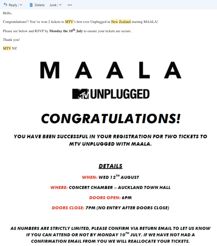
In the excitement of winning tickets, it’s understandable that we could forgive the use of Times New Roman and just the overall lacklustre layout in this email sent en masse to all winners.

On closer inspection, there are a few more things wrong with this.

Email received 07th July, which is a Friday. Instructions are to RSVP by Monday 10th July to confirm tickets.

What is wrong with this? Firstly, for those that entered with their work emails, or don’t check emails on the weekend, it’s likely that this email would go unread by many until recipients were back into the work groove on Monday.

Secondly, three days can be considered a bit short notice to make plans.

Thirdly, Wednesday 12th August, 2017, doesn’t exist! It did in the year 2015, but unfortunately, time travel isn’t an option just yet.

Email #2

email-2massive-facepalm-gif

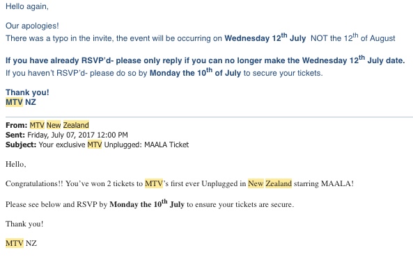
Well, that’s embarrassing! We can either assume that this little big mistake missed the multiple rounds of test emails, or that the marketing team skipped testing completely. At least they finally realised that serif fonts weren’t the best way to convey their messages.

A few things to take note:

  • Not a good first impression about MTV NZ (or the teams behind it)!
  • This email was sent Friday 7th July, promoting an event that’s only five days away.
  • They called the wrong date a “typo”, as though someone has misspelt “July”. Close enough.

Email #3

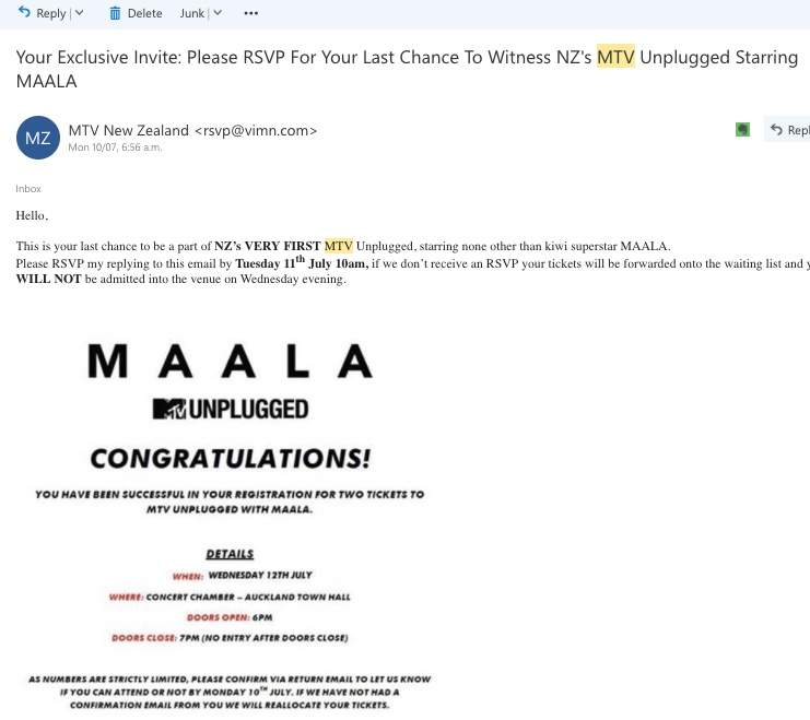
Do you think they got the hint that a single weekend wasn’t enough to wait for RSVPs? Or perhaps people found they couldn’t make it on Wednesday, 12th August, 2015?

Either way, they extended the RSVP date until the morning before the event. They also jumped back on board the serif train and still haven’t learnt that the way to communicate with digital natives is either through gifs, cat videos, or really, anything with a picture and a splash of colour.

This is a prime example of what not to do

So, MTV Unplugged hit New Zealand’s shores with quite a splash, and probably not in the best way. They also sent me an email confirming my tickets three times. Did this mean I had two tickets or six? Very confusing.

All in all, it’s a great example of how badly a brand’s reputation can be hurt by a few simple rookie mistakes. The whole event felt rushed, and while it progressed somewhat smoothly on the day, we can all learn that emails are still very important!

Hanging Gardens home page

Your home page is failing its purpose

I had to write to a client recently to tell them that their home page was failing.  It was not delivering value, it was not doing its job and was actively causing problems for the business.  And this made me realise that few businesses understand the job a home page does.

Hanging Gardens home page

Hanging Gardens home page

What should a good home page design do?

If you are an online shop, the home page has the job of showing the specials for the month or new product lines.  It is often a straightforward design to implement. 

If you are a software company, the home page is usually a sales page promoting and explaining your principal products.

But most business websites have a different challenge, especially those who do not sell by ecommerce.  They have had a website for a few years; they may have had a couple of redesigns and the business website has probably grown to tens, hundreds or thousands of pages over this period.  The priorities of the business shift over time and the website home page needs to support the new business goals and objectives. 

This throws up questions

  1. How often should I change my home page?
  2. Should the home page have all the information about the business?
  3. What should the home page prioritise?

The job of a website home page is to get the visitor to her destination in as few clicks as possible.

Why do visitors come?

Your entire website comprises a heap of different information, advice, products and services and a visitor may be interested in all, one or none of them.  So how can you guess what the latest web visitor wants? 

This is where intelligent home page design comes in. 

Home page as sign post

The principal task of the home page is to signpost the visitor FAST to where she wants to go.  So let’s work out what this means for your website.

Go to your web analytics account and find two reports created from your actual visitor traffic this year.  These are

a) the pages visitors went to on the site.  This shows which are the most popular

b) the search queries people typed into Google which had your website showing up in search results (this comes by linking Search Console to Google Analytics – here’s how to set it up).

Your job is to line up b) with a) so we get the maximum number of people coming to the site and getting quickly to the exact page they are looking for.

Designing for Destination

You now know the top two to five pages on your website (after the home page itself).  I’m going to offer some advice here which will help you brief your designer on the changes you need to make to your home page. 

Firstly – simplify the main menu.  Can you remove any of the top menu items?  Give the visitor as few choices as possible, stay focused on those top destination pages.  Can you reduce your menu to 5 options?  (Home, About, Contact Us plus 2 others?).  Can you remove sub-menus or drop-downs?  We advised Armour Safety to put icon images of their popular product groupings on a side menu; ordered by popularity.  Clicks followed immediately we made the change.

Secondly – highlight popular destination pages in the home page design.  Make it very obvious in the home page design elements what these are.  You can use images, boxes, icons, buttons, large text – all are useful devices to focus attention. By repeating these popular destinations in the home page design and the top menu, you increase the chances that the visitor will choose an already popular pathway.  Coxmate.com.au now does not show its products on the main menu – they send visitors direct to the shop which has its own home page and details all the categories.  Similarly, Apartment Specialists has 3 buttons on the home page, I’m Buying; I’m Selling and I want a Valuation.  All three are on their menu, but the buttons make it easier for visitors to quickly decide where to click.

Thirdly – you have to reinforce the already popular page destinations – this may sound counter-intuitive.  Don’t try and encourage traffic to pages that are not already popular i.e. double down your bets on the well-performing pages.  This is the 80:20 rule in action.  For the visitor who does want something unusual if they cannot find it from your menus, be sure to make it very clear how to get in touch to ask the question. 

So go check how your home page is performing in its duty as a sign post – and don’t be afraid to make changes iteratively – one small change at a time so you can measure the effect before altering other elements.

We use our 8 Step New Business Development process and each has a category – this blog post is related to Step 1 – State your Business.

Click on the icon to see more posts in that category.

8 step new business process. Step 1 Who are you?

This article first appeared in Marketing Online Magazine